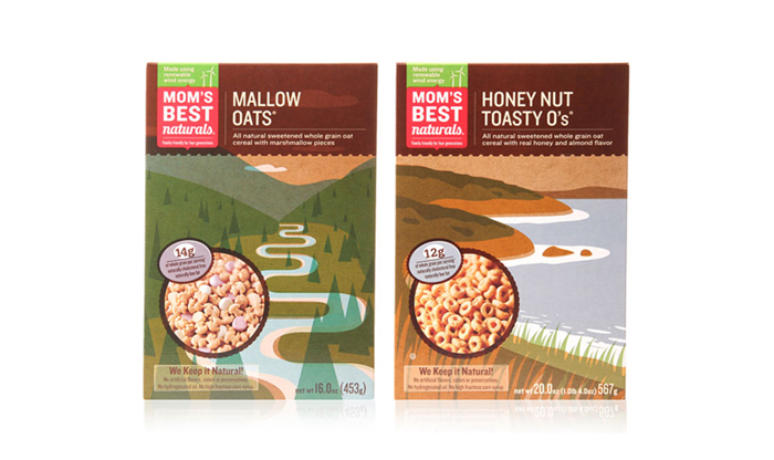
While grocery shopping today, I ran across this beauty from Mom’s Best Cereals. The (albeit faux) raw box design effect has a stunning impact on the store shelf. John Campbell, famous for his coined “Malt-O-Meal,” started a mill on the Cannon River in Minnesota in 1919. Today his legacy bears the fruit of eleven hot and cold cereal brands, including MOM Brand.
MOM Brand’s vision as the largest family-owned cereal company in the country, is to keep the quality but reduce the price for family consumers. This quality control is not solely apparent in the food product. MOM Brand’s commitment extends through the whole process, ensuring the way the product is packaged and manufactured is also environmentally sustainable. MOM Brand products practice the economical “Bag the Box” packaging, are composed of 100% recycled paperboard, and are produced with significant water and solid waste reduction. MOM Brand also partners with TerraCycle, a partner that recycles empty cereal bags from non-profits and schools, complete with rewards incentives.

Mom’s Best Cereals is by far the best design work to come out of MOM Brand. Designed by Kick out of Minneapolis, Minnesota, this packaging suite transforms minimalistic forms in subtle transparency overlays into landscapes enhanced by a recycled Kraft board backdrop. I’d like to ask Kick if the execution is what they had in mind—the kraft texture is actually printed over the recycled Kraft board, and the peekaboo printed cereal features seem a little forced and misplaced. That aside, the color, type and manifestation of this series is refreshing. Way to Kick.